

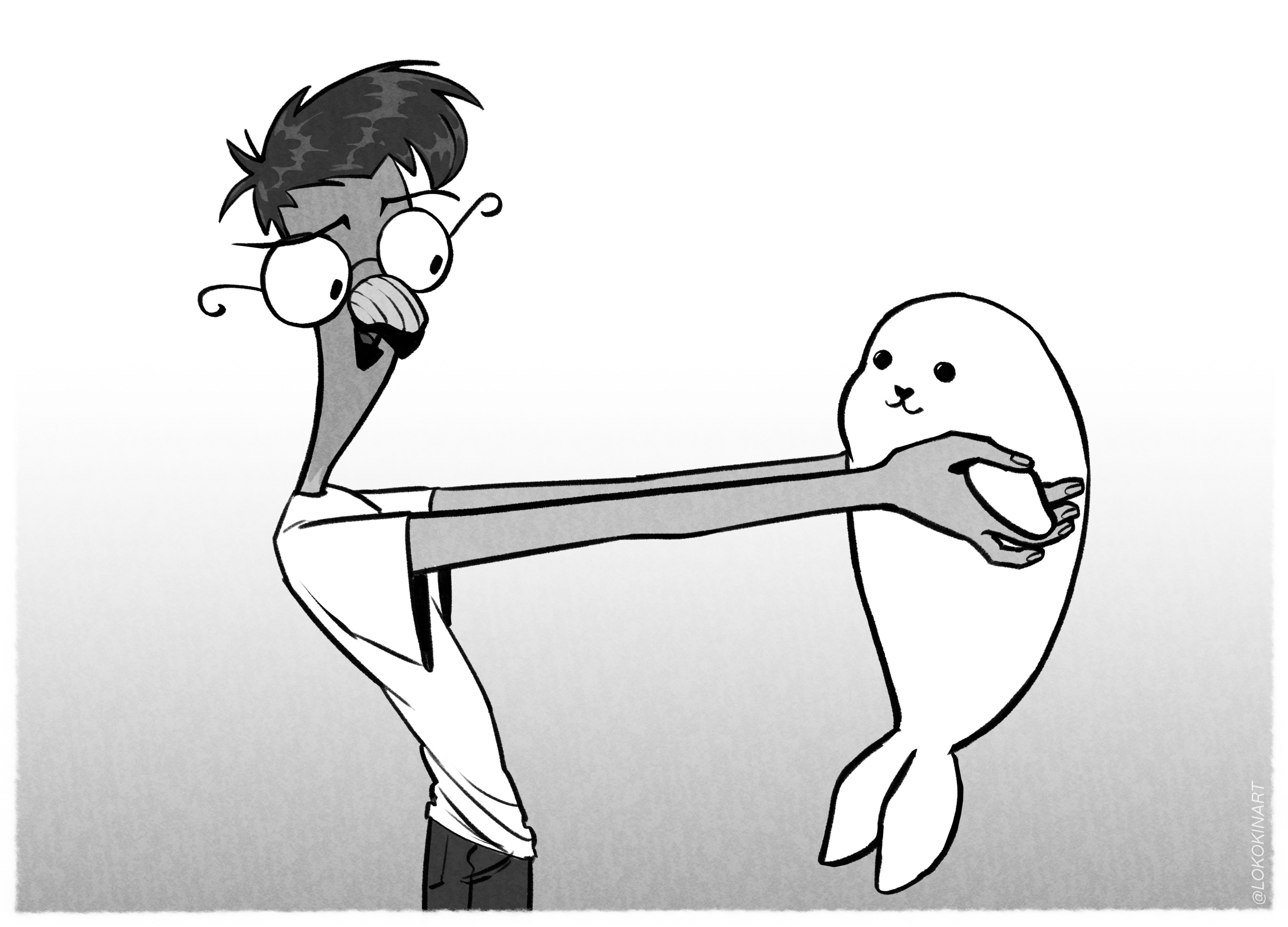
So the seal.
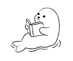
The seal....the seal. Alright, where to begin.
We have redesigned our brand like 100 times over the past few years. It started in the early days when we shot ourselves in the foot then stuck that foot in our mouths by releasing a human-like avatar for our logo.1
Lesson for all companies from now until the end of time: don’t do this. Humans come in many forms. Trying to make human work in branding is dicey and often needlessly others someone.
So, we just sort of piddled for two years, never settling on a brand identity or color scheme. Poor Nikita, our designer. We’d pester him endlessly for a logo. And every time, something would go wrong. And things went quite hilariously, catastrophically, wrong.
Let’s start small.
After the human incident, we just had our logo say “Chill Subs” for a long time. But that’s not a logo.
So after some long drawn-out fight, Nikita sent us this:

We were ecstatic. Maybe it was the build up to it? Or just the relief that we had something. We slept well.
And then the next day, our illustrator Mariam, sent us a message that went something like this: “Hey, BTW, this looks a lot like the logo for Clippings.” Which was this:
Notice a difference? No, that’s because it’s the same logo. I couldn’t find the one Nikita originally sent, but it was basically this.
So, in a fit of rage, Nikita pixilated the “C” and stuck an “S” on there and the rest of us were politely invited to shut the up.

Fast forward a bit. we get back to nagging Nikita again. He really doesn’t like this.
We can’t help it. We’re 5 years into what’s basically a 4-way sexless marriage, what is there to do in that situation but bicker and nag? (okay technically this isn’t true since two of us have been together for four years and want to get married but can’t because we don’t have a logo).
And so Nikita stuck squares around the c and the s.

And I kid you not when I say we were blown away. Maybe it was his plan all along, to keep expectations low, draw it out, and then swing in with some block letters to impress us. IDK but that settled us for a long while. But the wider problem wasn’t solved. Block letters does not a brand-identity make. You can’t just put everything in boxes and call it a business. Lidl already cornered that market (Hey, Europeans, I see you).
So we hemmed and hawed, and hawed and hemmed, and Nikita found a tattoo artist in Tbilisi he liked to create a character pack for us. And it was so cool! She designed all of these cool characters. And one in particular became the cornerstone of so many images. It was so cute. This lil guy
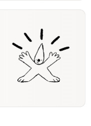
We put him everywhere.
Awe, look at him read the newspaper! Naughty kid.
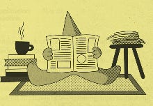
Rascal
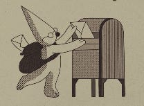
Do you see where this is going yet?
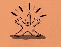
Cause we didn’t
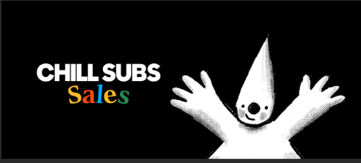
Until someone pointed this out.
See if you can spot it...
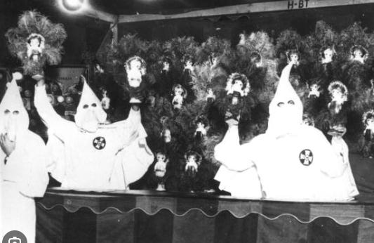
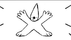
……………………yeah.
yeah. This was our social media manager’s response when we showed her:
At this point, Nikita promptly gave up.
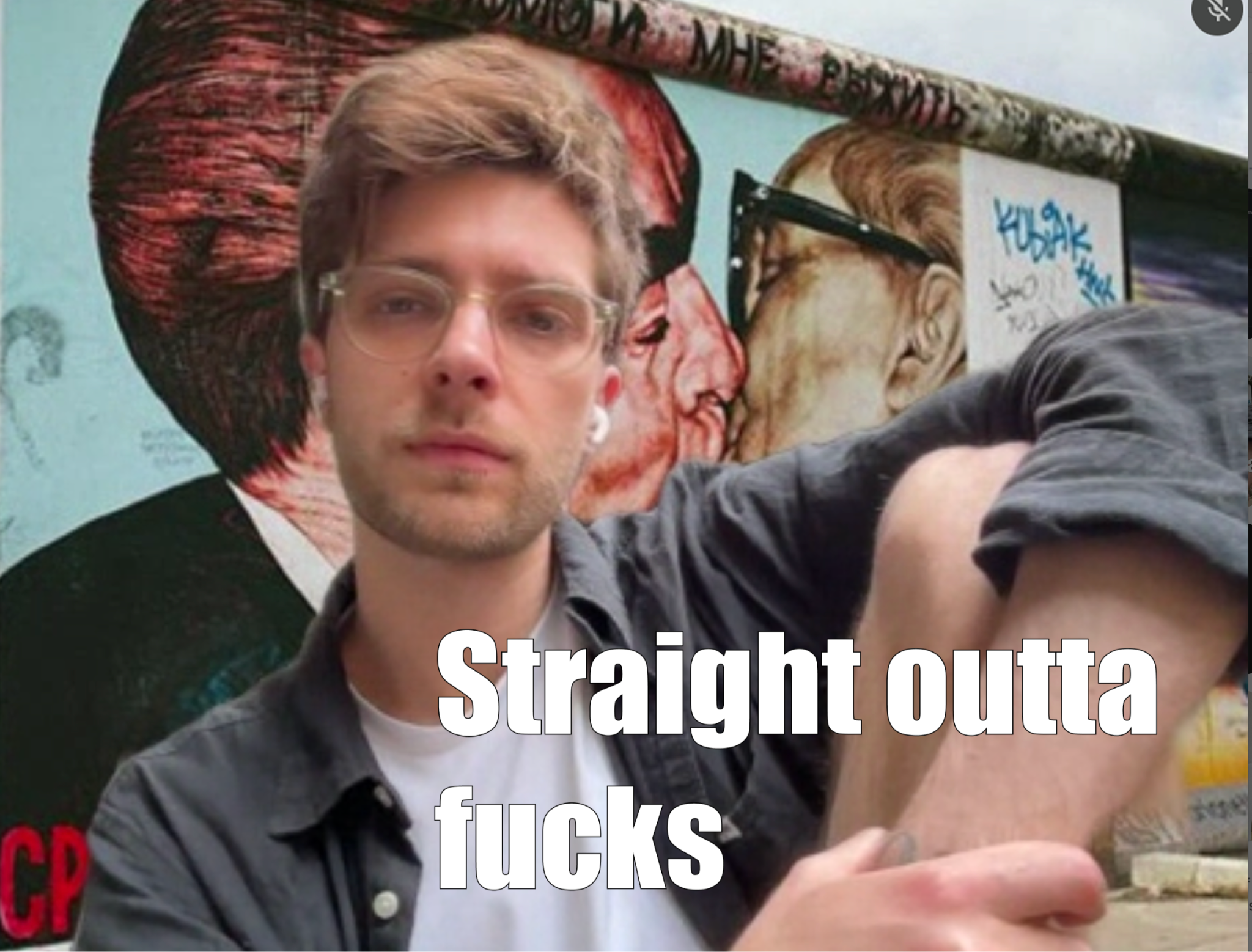
The last thing you ever want to do as a brand is be a reminder of one of the ugliest chapters in humanity (arguably one we’re still in). That is like...lesson #1 of branding.
Alright.
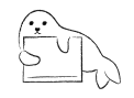
So that brings us to the fucking seal.
Okay, wait, but first real quick. You need to understand something about where the name “Chill Subs” came from. And the truth is, nowhere. Karina was two beers in, fiddling around on domain sites, trying to find something, anything, that was related to the literary world that was a .com address.
We were almost “Lit Finder.” Imagine that. Ew.
So there was no think tank. If there were, they might have pointed out that “Sub” is something very different in some circles. Specifically, sexy ones. Not that indie lit isn’t sexy! Just...like really sexy.
And yeah, we have some social listening software and 9/10 when someone is talking about “Chill Subs” they are either looking for a sandwich, or someone to hold the sandwich for them. If you know what I mean. It’s okay if you don’t know what I mean, cause I don’t. But like, we all get it.
Anyway! So we’re already fighting an uphill battle when it comes to not being a sex thing (or a sandwich thing).
Remember that.
So the seal.
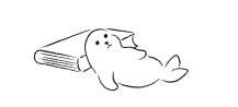
Nikita gave up (this happens a lot. Don’t worry, it’s part of his process). He decided he was too close to the brand and would continue to over think it. After a lot of research, we found a brilliant design agency in Tbilisi (where Karina lives) called Vivid Cereal.
It’s probably not a great sign when the first directive to an agency is, “please just nothing racist or perverted or anything that will remind people of sandwiches” but they took us on anyway.
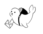
We had a lot of meetings, yada yada, and they came back with this seal. And there was a lot of arguing about the seal. Are we a minor league baseball team? Are we a children’s library? No! We’re a maybe sex thing literary database that doesn’t sell sandwiches but what does that have to do with a seal?
In the end, we were convinced. Because our brand has a lot of personality, but we’ve been careful not to put any one person as the front-and-center voice. That’s because of the bus problem. The bus problem is something a developer told us about where you can’t have only one person know how something works because if they get hit by a bus, you’ve got a problem. Since we’re a small team, we are all very very wary of buses.
But with branding, we’ve done pretty good. If any one of us died tomorrow, nobody on Instagram would know. What a warm and fuzzy thought.
So a mascot could give us all of the personality with none of the risk.
We only had one question for the designer. “Why a seal?”
And she had maybe one of the most confident answers to any question I’ve seen asked in my lifetime:
“Why not?”2
That got us. Why not. So…
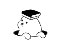
So now what to do? Well, what does anyone do when they get a seal? Name it.
And there we had a problem. See, during the entire design process, we’d started to call the seal “Chubs.” It made sense at the time. Chill Subs → Chubs. It was perfect. Unless you google chubs right now and learn that one of the definitions is something, very, very different. There is a “chill sub” somewhere being so chill that there’s only “chub” joke to be had right now, but I won’t make it. I’m better than that.
But, we couldn’t stop calling it Chubs. Everyone in the company, “Chubs, chubs, chubs...what do we call chubs?”
How. do. we. never. learn.
And then there was the story behind Chubs. Why—in the living hell—is there a seal now?
What do we tell people?
Can anyone come up with a better reason than, “Why not?”
Some threw around the idea of making it a climate changed themed story and, unfortunately, the writing world is the most old-school fuck-trees industry there is. So we were going to do a contest to see if someone else could come up with a name and story for the little fella. But that would cost time and money and we just spent a shitload of time and money coming up with this fucking seal. This is what business is, by the way. It looks really cool in the movies or on podcasts. But it’s mostly sitting on a computer shouting at people over seals3. Then Shel’s dad wrote us a story for the seal4. In the story, he calls it “Chubby” which is probably the only thing worse than “Chubs,” other than maybe “Adolf” or if we just went full-send and called him “Penis.”
But it gets worse because the only image of the seal we had that fit as a logo was this one.
And how the color scheme came out meant that the background was this:
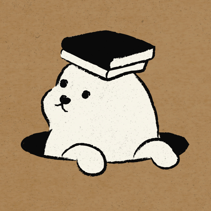
And like….that’s a gopher, right? Prairie dog at best.
So we fought even more. And by now we have a whole new designer who works with Nikita named Tanue who started full time just in time to get shouted at in slack by multiple people saying:
“THAT’S NOT A SEAL IT’S A GOPHER!”5
Words were said. Things were thrown. Someone sent this
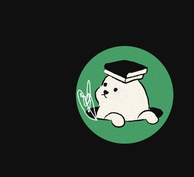
It was a lot. And finally we landed on blue as the logo because at least nobody will think it’s a ground seal. And then we put the seal up and guess what?
Not a single person said a single word. We have over 90,000 users. Our Instagram just hit 115,000. And not a soul said, “Hey, so what’s with the seal?” Nobody asks its name. Nobody wondered about its story.
Because that’s the lesson to learn here for anyone who ever wants to start a business and is worried about their logo. Design is way more than just a logo and someday I’ll get Nikita to come in here and talk about it with you all. But when it comes to a logo? I’m not sure anyone cares nearly as much as we do.
People care about the business bits. And the business bits are pretty straight forward. Do free thing good. Do paid thing better.6 Like tomorrow, if we were to stop keeping our data accurate, if our tracker broke, if we just stopped sending things out on sub club…nobody is sticking around for Chubs.
And yeah, we gave up, his name is Chubs.
Everybody say hi.
I’d show it to you, but it was unceremoniously burned
Not quite. This designer was actually very good at convincing us. She did say why not. But then she had a whole presentation showing the evolution of the penguin from penguin books. And said this: "A specific animal mascot is often more memorable and creates a stronger brand association. Why the Seal: I’ve been thinking about the Penguin Books origin story. Did my research and and apparently they chose the penguin because its "black tie" look felt both dignified and fun. I believe we can do something similar with the seal—positioning it as a "diver for knowledge" who brings insights to the surface, or even dives into the cold world of publishing to save all us writers :)”
Do literally anything else.
Shel’s Dad’s Story: The story of how a lonely seal turned into the beloved ambassador of independent writer's favorite website, Chill Subs. Way back in the spring of '22i, a family of Mediterranean Monk Seals got separated on the way to visit the pyramids. Slowly, Chubby, the smallest of the seals, two brothers and three cousins. Chubby eventually lost sight of the others. He was so tired from trying to keep up, he had to take a nap. He swam over to a quiet, rocky beach on Princess Island. Where Ben, Shelby, Karina and Nakita were celebrating the launch of Chill Subs. The group took a stroll along the beach. As they were walking along, Shelby was on the hunt for Jellyshoes, and Ben was keeping his eyes peeled for whales. Karina noticed Chubby on the beach whimpering. Nakita went over to find out what was wrong. Soon all of Chill Subs OG's gathered around Chubby and introduced themselves. Chubby explained his situation. He had eaten too much cheese and could not keep up with the rest of his pod. Ben told Chubby that they had the connection and tools that he could use to write about his family to improve his chances of being published in the hopes that his family would read it, knowing he was fine and living with his new friends. And that's the story of Chubby, the Chill Subs mascot.
okay it was mostly me yelling
Or solicit loads of investor money, get millions of people addicted to your product, buy up your competitors, become more addicting than cigarettes, package up your users and sell them into a soulless AI algorithmic dystopic engine of depression-inducing doomscrolling so somebody can sell them sneakers that don't get wet in the rain.
This was wildly amusing although I do care about your pain. Sorta. 😉
Very excited about the seal! Also love the seal's origin story disguised as a branding lesson 😄🙌🏻